
OpenAlea.Pylab User Guide#
Introduction and Motivation#
This package is a pure VisuAlea package that provides a graphical interface to Matplotlib, which is a python package for 2D and 3D plottings. When combined with Numpy and Scipy packages, Matplotlib becomes a great tool to analyse and visualize scientific data. Due to the versatile capabilities of Matplotlib with many options and arguments, it may sometimes be quite cumbersome to know what are the arguments of each function – despite the great documentation that authors put online. This difficulty motivated us in developing a visual interface of Matplotlib within VisuAlea.
Note
this package is called openalea.pylab instead of openalea.matplotlib so as to be as close as possible to the python commands that you would use in a Python environment. Indeed, if you were to use the plot command of matplotlib, you would type
from pylab import plot, show
plot(x,y)
show()
Warning
This documentation is not a documentation about Matplotlib usage. Neverthelees, concepts, options, function names used within the VisuAlea nodes are very similar to the original version. Therefore, usage should be straightforward to people that are already familiar with Matplotlib.
Overview#
Note
In pylab terminology, a figure is a window, where several axes can be plotted.
All public nodes can be found within VisuAlea in the Package Manager by browsing into the OpenAlea.PyLab directory.
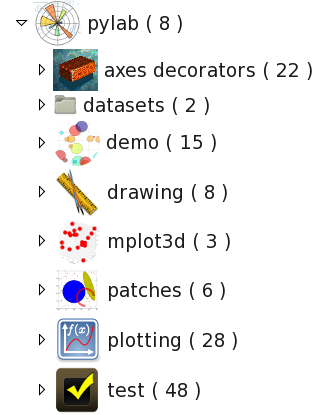
The openalea.pylab contains several sub directories:
axes decorators that are used to add labels, title into an axes, or to tune the axes itself
datasets that could be useful to play with in demos and tests
demo that illustrates the usage of the VisuAlea nodes
drawing provides further nodes to add annotations to an axes
mplot3d is related to mplot3d (3d plotting nodes)
patches is related to pylab.patches (patches that can be add to an axe such as Ellipse, Circle)
plotting contains all pylab plotting function.
test tests of all nodes.
First example#
Let us start with a simple 2D plot that would be done as follows in pylab:
1from pylab import random
2from pylab import plot, show
3x = random(100)
4y = random(100)
5plot(x,y)
6show()
In VisuAlea, you first need to create the random data using the randn node (equivalent to line 3,4).
Let us drag and drop two of those nodes in the workspace. Then, you need to select PyLabPlot. This node has many connectors but just keep in mind that the connectors roughly follows the same options as the original pylab.plot function.
Note also that, in VisuAlea, the first connector is reserved for the axes. So, you need to connect the x data to the second connector and the y data to the third connector.
Warning
the x and y objects must have the same length.
Warning
if after connecting the x and y objects you decided to remove the y object, you will have to reload the plot node to reset the y data.
Now, it is time to run the dataflow. Press Ctrl+R or right click on the PyLabPlot node and select run (equivalent to line 6).
Now the first questions arise:
What kind of options do I have ? What shall I do if I want to increase the size of the marker(see next section)
What about xlabel and title ? (see Enhance the layout section)
What if I have multiple xy data, or if I have several y-data that shares the same x-data ? Is it possible to get something equivalent to the pylab command plot(x, y1, x, y2) ? (see multiple data set section).
Playing with the options/connectors#
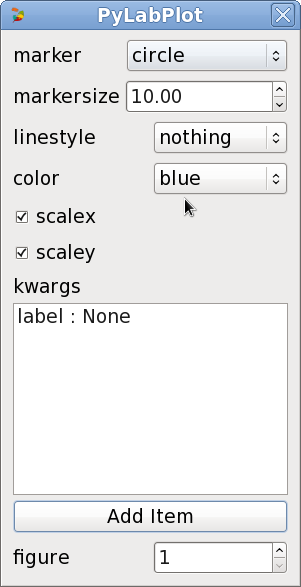
If you right-click on the PyLabPlot node then a pop-up window appears (figure above). The first options (marker, markersize, linestyle and color) are specific to PyLabPlot_. The figure options is common to all the plotting nodes. To further customize this node, you need to know the pylab options and add then in the kwargs section as key/value pairs. Another way is to convert the x/y data into a specialised object with PyLabLine2D_ as explained later on.#
So, in the pop-up window, we can select a different marker with a different color (e.g., square, red). Now, again the question is what if we want to change the transparency of the marker (the alpha option in pylab terminology). Well this is not possible as it is… since it is not part of the connectors. Because it is not reasonable to set too many connectors/options, we created a specialised node inspired from pylab class pylab.Line2D, which is called PyLabLine2D_. It allows to convert the x and y input data sets into a matplotlib data structure that can be fully customised. It works as follows:
multiple data set#
In order to plot several datasets, the best method is to use the convertor PyLabLine2D
as many times as needed. Indeed, this method allows to customise each data set independantly.
This is also the simplest method to add specific label to a curve, which becomes handy when legend is required.
1from pylab import random
2from pylab import plot, show
3x1 = random(100)
4y1 = random(100)
5x2 = random(100)
6y2 = random(100)
7plot(x1,y1, 'ro', label='data1', x2, y2, 'bo', label='data2)
8legend()
9show()
Warning
all data converted with PyLabLine2D must be connected to the x connector only.
Note
the PyLabLine2D node may have a x data set only; y is optional.
If you do not want to use the PyLabLine2D, you can still connect
several data sets directly to the PyLabPlot nodes but customisation is not possible.
If several x and y data sets are connected, then PyLabPlot will automatically select a color for each of them. Finally,
you may connect a single data set to x, and several data sets to y connector. If so, x data set is supposed to be common to all y data sets.
convertor such as** PyLabLine2D
Enhance the layout#
In the previous section, we’ve seen in details the PyLabPlot node. There are many more nodes with
the same kind of behaviour and usage, which are fully described in the reference guide. None of
those functions allows you to customize the axes. To do so, you will need to use the
py_pylab module.
This module provides nodes that allows you to add elements into an axe (e.g, labels, title, legend, grid), or to modify the axes (e.g., axis, xlim, xticks). There are even more elements to be added such as patches (see mod:~openalea.pylab.patches_wralea.py_pylab).
As an example, let us consider the case where you want to have an xlabel in red color. In addition, you want to restrict the dimension of the Axes so that it corresponds to a lower left axes in the figure. In pure pylab, you would write something like:
1from pylab import plot, show, xlabel, figure, axes, random, legend
2figure(1)
3x = random(100)
4y = random(100)
5axes([0.15,0.15, 0.4, 0.7])
6plot(x,y,label='data1')
7xlabel('my customised red label', color='red', fontsize=18)
8legend()
9show()
That would be coded in VisuAlea as follows by connecting a PyLabAxes
and PyLabXLabel nodes to the corresponding functional connector:
Some Examples#
Adding patches#
With pylab, it is possible to add patches such as circle, ellipse, polygon, etc on top of a axe.
Some of those patches are available as visualea nodse. Look at the patches reference section to see how to use them. There is also a demo available called patches, which dataflow looks like:
3D plotting#
Some 3D plotting are also available. See mplot3d module in the reference. The following dataflow gives you a flavor of what it looks like.
2D plotting#
Many more nodes ara available. Most of the 2d plotting have been wrapped. Here are only a few examples of dataflows with their outputs.
See the reference guide for full details of the 2D plotting module.